So what is composition? Composition is what guides our eyes through an image to find the subject. Composition through flow and direction helps the viewer appreciate the image. It is one of the most important components of photography and it will help turn a scene into art.
Here are 5 rules of composition that can help you make more dynamic images:
1. The Rule of Thirds
When starting out, it is natural to place your subject at the centre of the frame. Having your subject in the dead centre of an image will often look boring and predictable. Don’t worry, everybody does this at some point.

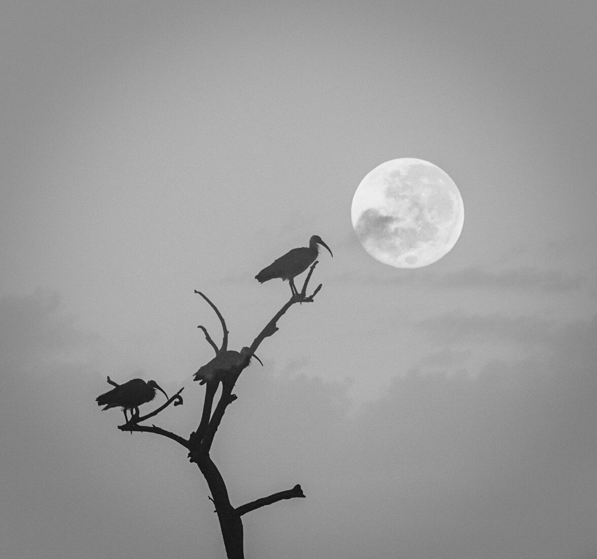
The Rule of Thirds is one of the most popular compositional techniques. The Rule of Thirds divides your scene into a 3×3 grid with equal size rectangles, like naughts and crosses, like above. To follow this rule, compose your subject in one third of the frame or on the line. This creates a more dynamic and pleasing composition since it gives more emphasis to your subject and its surrounds. On many cameras and certainly on your phone, there is a grid you can turn on to assist with this composition.

The bird on this this image is placed perfectly in the rule of thirds.
If its a person, be aware of the direction that they’re looking or moving towards. Generally, it is better for them to look or move into the frame, like the bird in the above image.
The same holds true when you’re taking a landscape photo; it’s more interesting to put either the landscape or sky in two-thirds of the frame to give it more importance. It really depends on what is more interesting in the image, the sky, or the landscape.
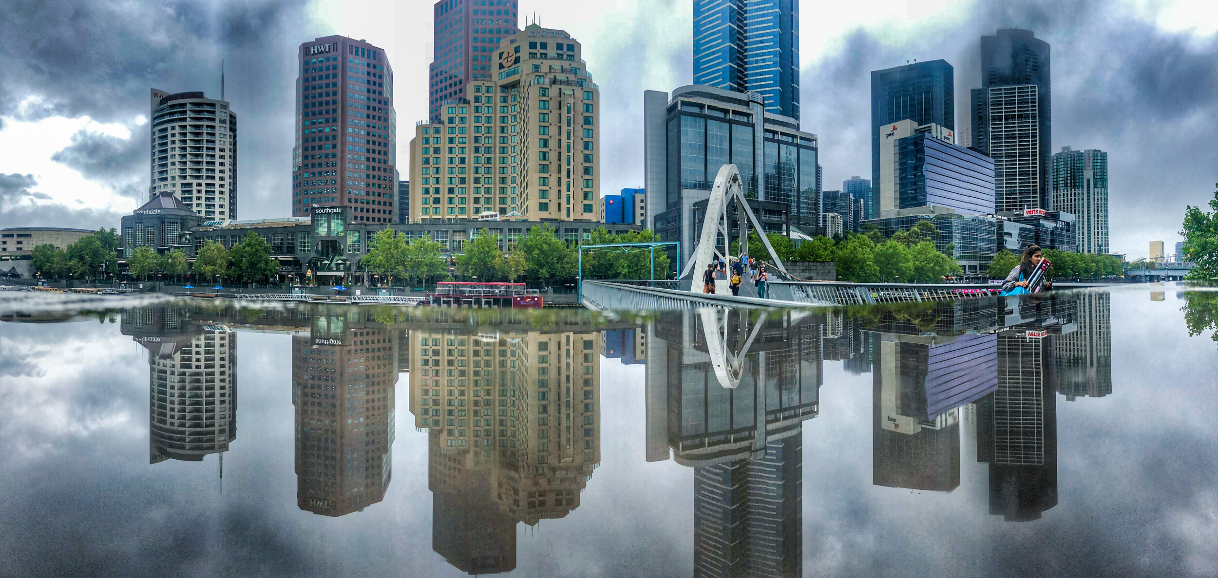
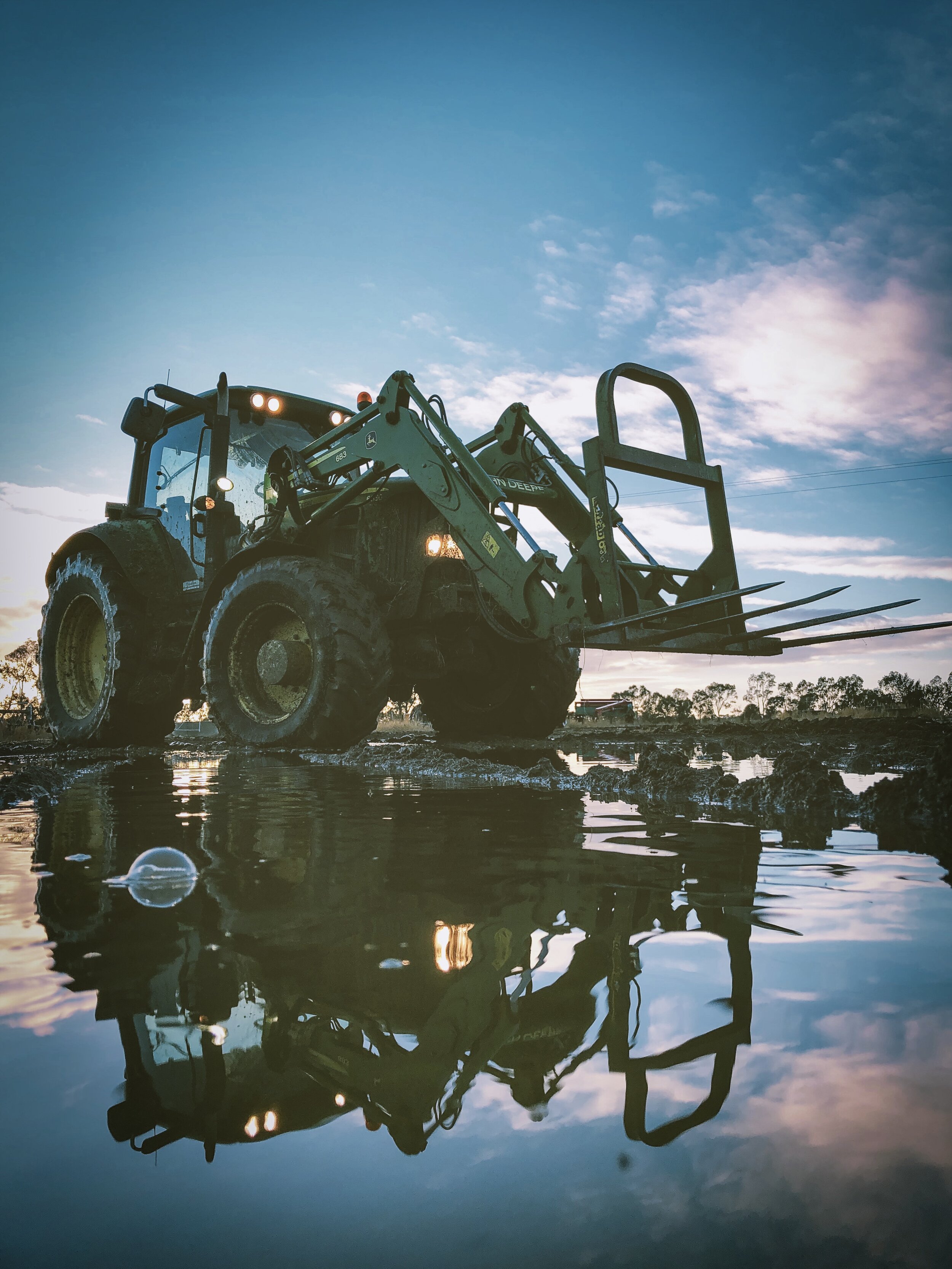
Like all of the rules, there may be times where you want to break this rule. For example, it you’re using reflections in a photo, its usually best to have the point of reflection in the centre of the image.
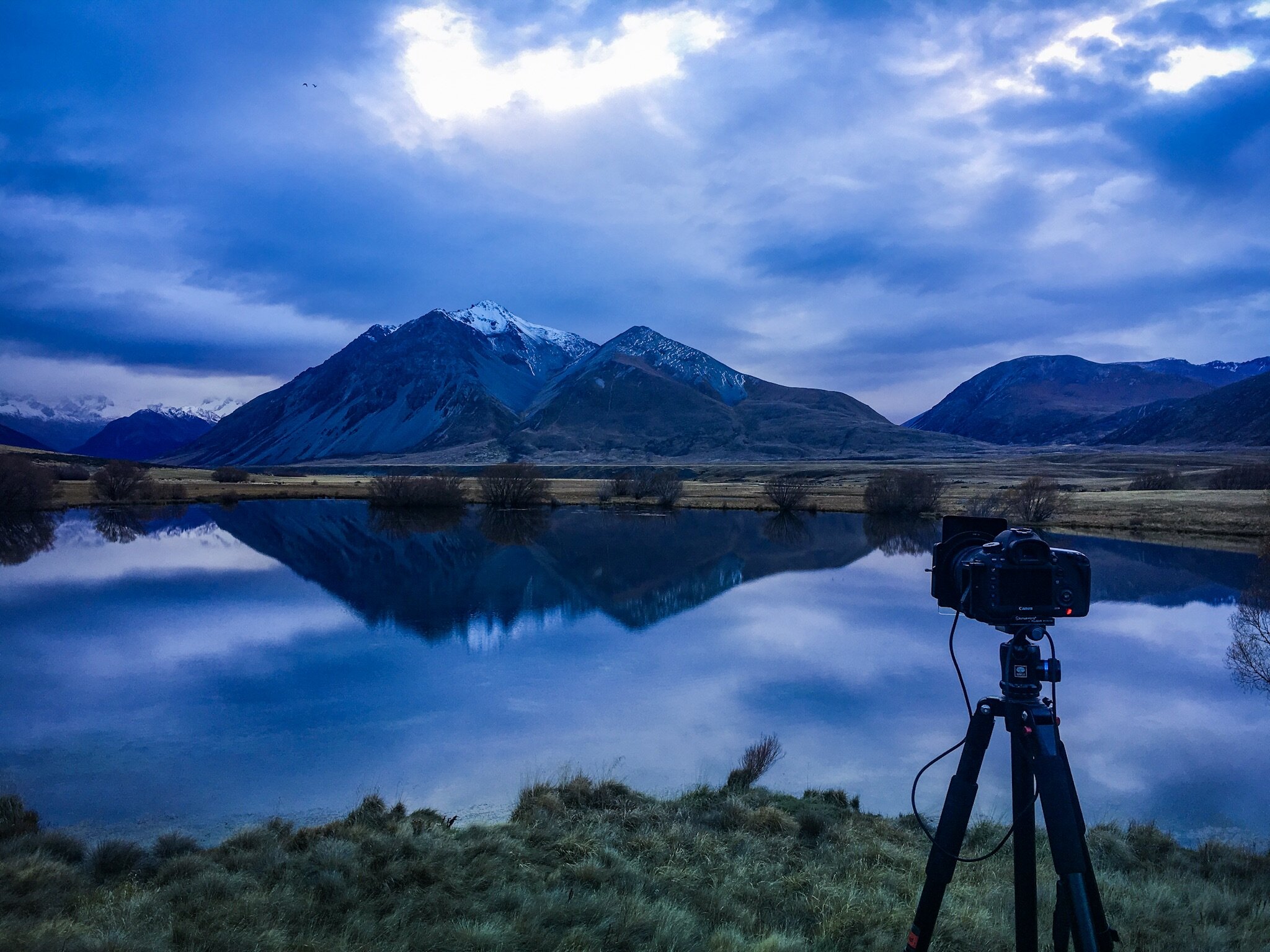
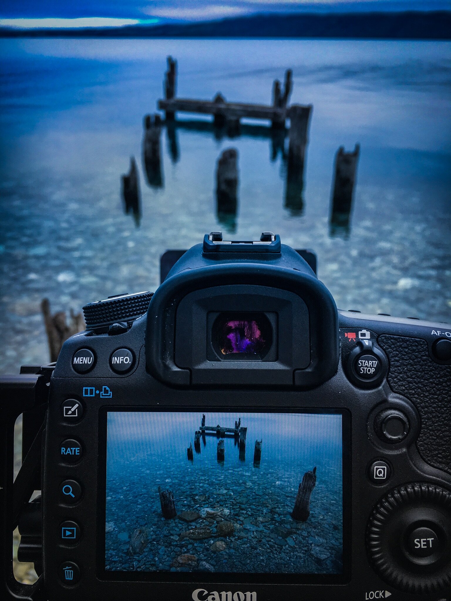
Here is an “on location” shot I took on a trip to New Zealand. You can see the effect the reflection will have.
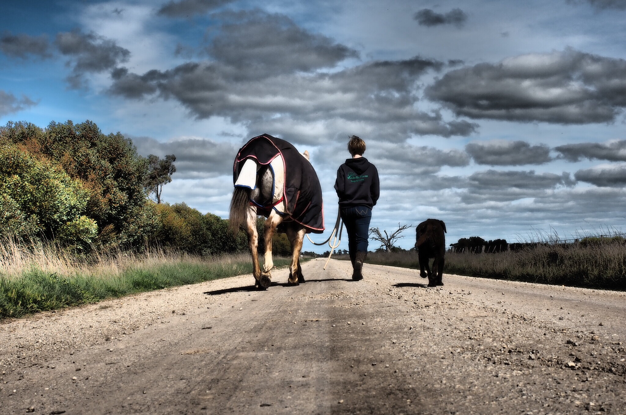
2. Leading Lines
Leading lines are diagonal lines that naturally exist in a scene which help the viewer’s eyes move from one direction to another. The lines are created from converging perspectives as seen through the camera. They should be framed in a way that draws the viewers eyes towards or through the primary subject. These lines don’t need to be a road, or path or fence line. They can be anything that draws the viewers gaze where you want it to be. Here are some examples.
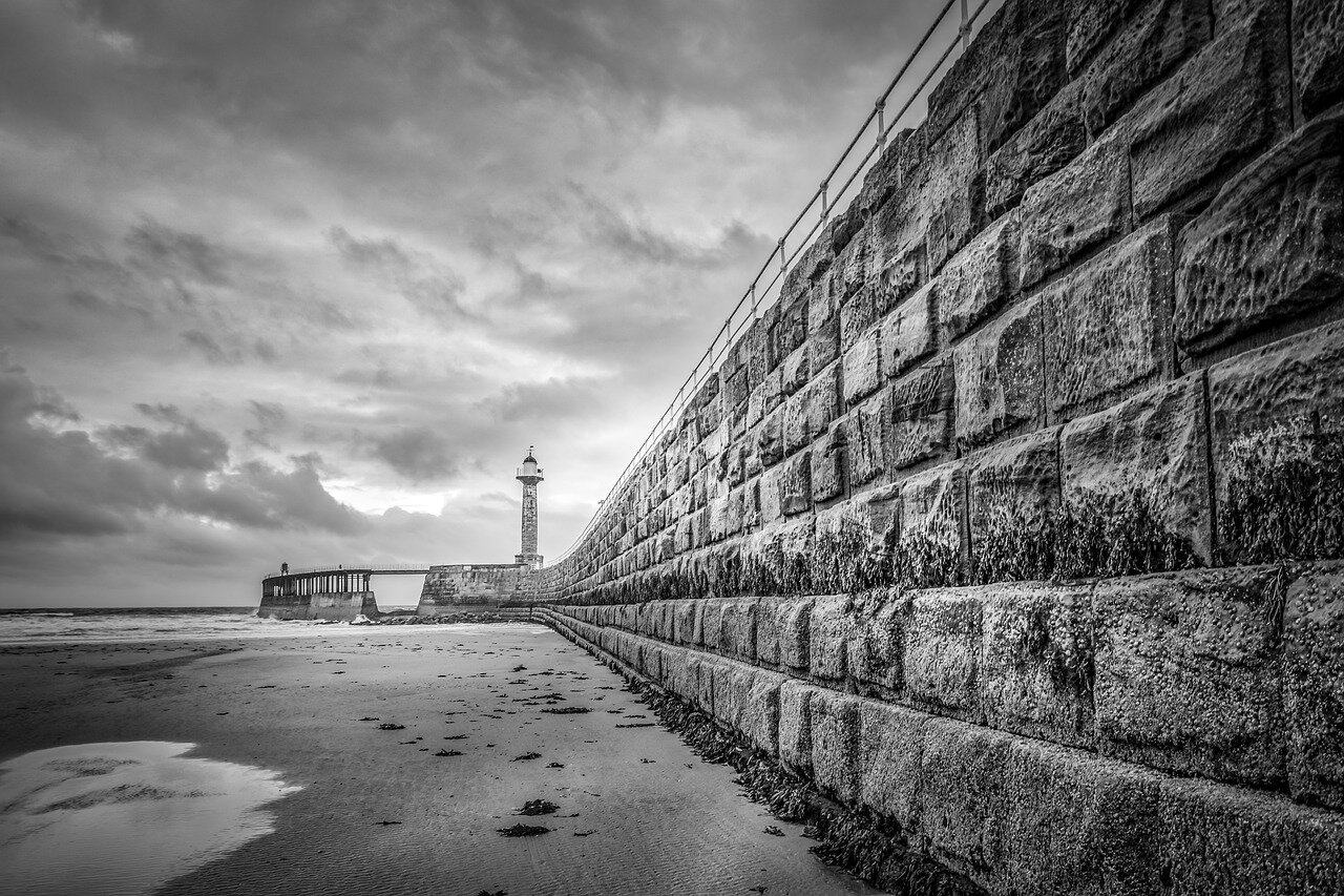

3. Negative Space
To achieve negative space in an image, you pretty much want to remove anything in the photograph that takes your attention away from your primary subject. This can be anything from a Styrofoam cup, a busy tree branch, or any busy details on a focused background that doesn’t help enhance the scene.

The whole sky in this image is considered negative space
This, of course, doesn’t mean that you can nor should you only shoot against a plain background. But there should be plenty of space in the image that has little or nothing in it.
Shallow depth of field is another great way to reduce clutter and give visual weight to your subject.
4. Contrasting Colors
Another way to make your subject stand out is by using contrasting colours. Examples of this include vibrant vs muted colours, warm vs cool colours, and dark vs light colours. The last one, light and dark, is especially important because our eyes tend to move from darker colors towards lighter colours. This is really effective with flowers and very colourful sunrises and sunsets.


5. Camera angles
Whilst this one isn’t exactly a “rule” of composition, its one of the best tools to get you thinking more creative about the other tules. It can be used decisively with each of the above-mentioned rules to help push the idea, concept or emotion that you want to convey at that moment of your shot.
Directly from above and can make people or objects seem insignificant or part of something that’s larger than what’s in the image. This is really effective for flat lay photography.

Flat lay images are really effective for social media posts and advertising.
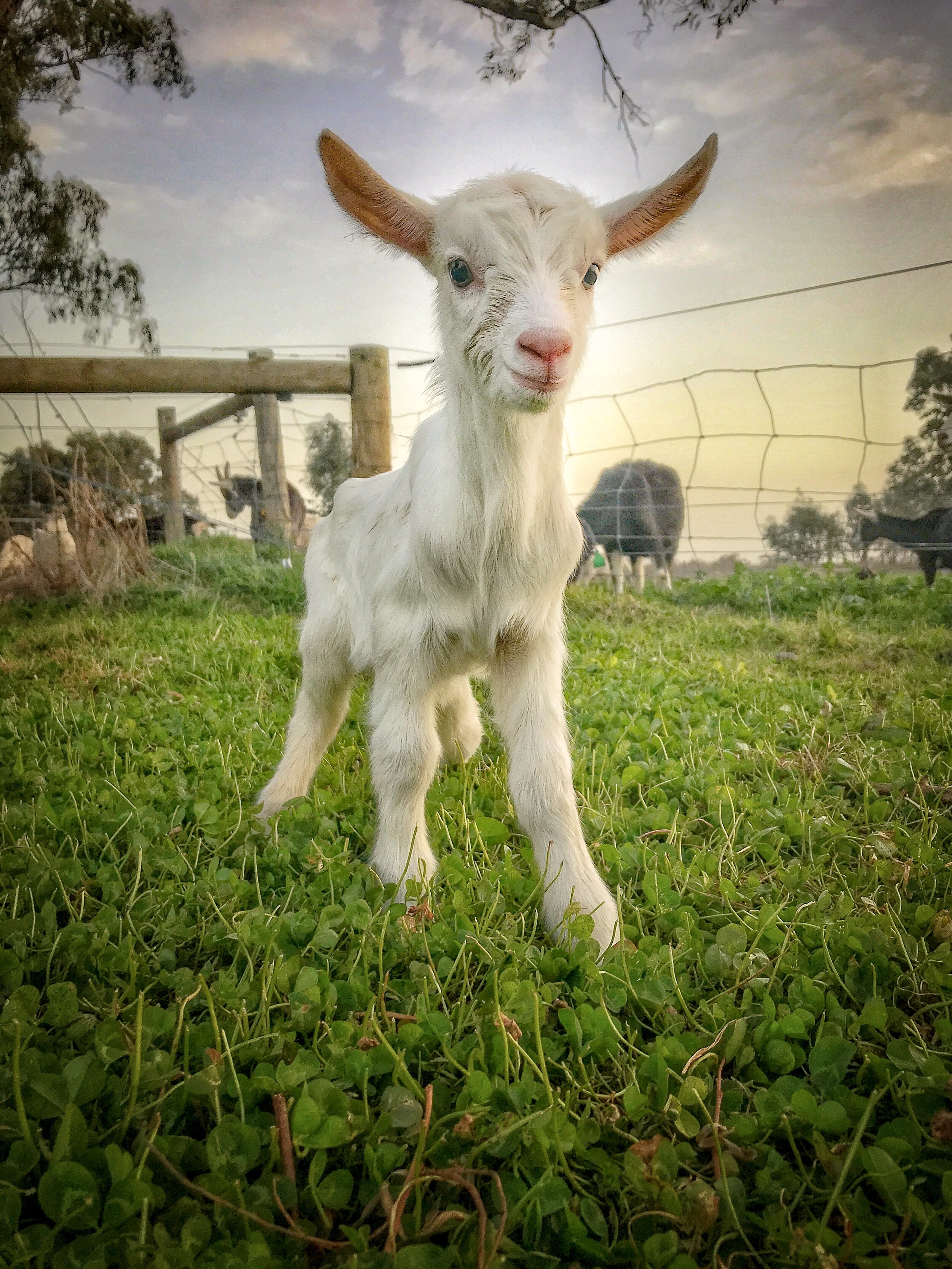
Going to the extreme opposite of this is getting down to the low angle shot as it provides disorientation since it gives such a different perspective. It also creates fear and insecurity in the audience since the subject is higher and dominating the shot. This is extremely effective with phones. Because the lens on a phone is very small and usually close to the edge of the phone, you can get very close to the ground and angle the shot upwards. Here are some very low angled shots.
Conclusion
These composition rules are not set-in-stone rules, but you will have a better understanding on what makes a photo compelling and also when breaking away from standard composition rules can work for you. Remember, you’re the judge of your own images. If you think an image you’re shooting works better by breaking these rules, break it!